Earlier this year comScore found that users are now spending 65% of their digital media time on mobile devices. This is no surprise and reinforces the need to develop projects with a ‘mobile first’ philosophy.
Taking a ‘mobile first’ approach means making tough decisions on how best to use the limited screen space to deliver users valuable, frictionless digital experiences. Optimising the use of the limited space we have to play with has given rise to a raft of user experience and user interface techniques with the use of iconography becoming commonplace.
As the cliché goes, “a picture is worth a thousand words” and the humble icon is a great example of this in action. When used well icons can elevate an interface and provide valuable context for our users but as with all things digital they can have a detrimental effect when misused.
Here are a few tips to help you avoid common mistakes and get the most out of your icons on your next digital project.
Make them meaningful
Picking the perfect icon usually means deciding from many options, which are all suitable in their own way. When doing so, keep your audience in mind and make sure the icon is meaningful in their eyes.
You can reinforce an icon’s meaning by supporting it with a text label, studies have shown that icons not supported by text are less effective than their labelled counterparts. If labels won’t work in your interface then consider introducing your icons and their functions when you on-board your users.
Also remember to consider cultural nuances as icons that might make sense in a one cultural context may not have the same impact in another.
Stick to convention
Differentiation online is important but when it comes to iconography sometimes sticking to tried-and-tested choices is the better option. Icon use in graphical user interfaces is not a new concept and many icons have now become ubiquitous with what they represent. This is particularly true of icons that support tasks like search (magnifying glass) and eCommerce (shopping cart). Sticking to convention gives you the best chance at knowing how your audience will interpret your icon choices.
 For example, looking for ‘search’ icons on The Noun Project returns over 5,000 results with the majority depicting the magnifying glass – an icon that has become synonymous with search functionality.
Keep them simple
The best icons are often the simplest ones. Avoid icons that are too detailed, contain internal text elements or that need colour to make sense. A great icon makes sense at a glance and works at all sizes (especially small sizes).
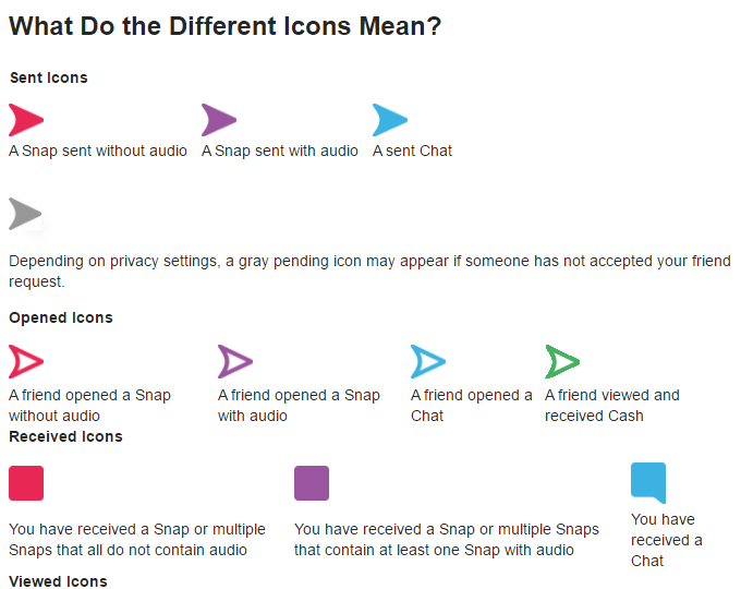
Snapchat has a particularly confusing icon set that uses colour to give the same icon a different meaning – this is definitely a practice to avoid.
Test and learn
The above considerations will go some way to helping you choose the right icons for your project but nothing replaces real audience feedback. Test, learn and iterate till you find the perfect icon that resonates with your target audience.


